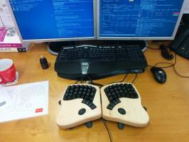
This week I was given access to a rather curious piece of hardware to evaluate, the keyboardio Model 01. The designers are holding their work to high standards of “uncompromising typists”. After using it more or less exclusively for a week I feel disinclined to get one for myself and here’s why.
The Good
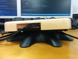
The build quality is excellent, probably the best I’ve ever seen in a keyboard. The wooden casing contributes a lot to this impression as does the adjustable stand.
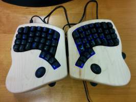
Besides the casing a lot of thought went into reducing the clutter that plagues conventional keyboards: Keyboardio drops cruft like arrow keys, a numpad, and separate function keys, resulting in a very compact, no-frills layout.
Probably the best thing about Keyboardio is that it is fully programmable by editing and compiling the firmware for its Atmel ATmega32U4 microcontroller. The default firmware is free software and rather hackable. Introduce new layers and layer switching behavior? Trivial. Add some useful LED effects? No problem. Macros and arbitrary key mappings that work everywhere and not merely under X or the console? Easy. None of it requires messing with GUI tools either. This is how keyboard configuration should work.
The customizations I applied to the firmware are available in my keyboard layout repo. (The per layer LED colors require the third party Layer Highlighter plugin.)
The Meh
Setting up the cross-building environment for Arduino is rather tedious and makes some idiotic assumptions about installation paths, but thankfully a coworker already had that bit figured out for me. Just make sure you ignore the official recommendation to pull in some IDE as the build environment. Once set up, building and flashing works just fine without that extra baggage.
Personally I couldn’t warm up to the mechanical key switches. After half a lifetime working on Thinkpad and MS Ergo style keyboards, the extra effort required to actuate a mechanical switch has a severe effect on overall finger nimbleness and seems to induce fatigue much quicker. Needless to say, these Matias switches will in all likelihood last longer than even the keyboard on my old X40 did. But that property is among the harder to evaluate during a one week trial.
The layout is dominated by the intention to relieve the pinky by moving as many of the normally outer keys as possible to the index finger and thumb. Switching all those in one go wreaks havoc to muscle memory. After settling on a sensible mapping of the thumb keys and inner keys, the learning phase is painful.
Orienting the two halves in a negative angle away from the body results in hands resting not on the palm but uncomfortably on the wrists. This also causes extra strain when lowering one’s seat relative to the desk, something that is perfectly feasible with the MS Ergo. IMO these palm rests should be curved downward to allow for a less straight hand position.
Both the official documentation and the available plugins can be rather outdated, much of which can be worked around by applying the advice given in the upgrading guide. There is also room for improvement regarding the description and usage examples of those plugins. For instance the Colormap one supposedly allows lighting up layers in individual colors but completely fails to show how it is meant to be used.
The Painful
Combine the above with the deep travel of the mechanical switches and you’ll find your fingers constantly triping over keys. The narrow inner columns operated by the index fingers in particular are hard to develop an intuition for. E. g. it requires enormous concentration to avoid hitting tab instead of g or enter instead of h. The constant need for fixing up borked index keypresses distracts from the job at hand. Often you hit the right key only after backtracking three or more times which thwarts any attempts at focusing on the task at hand. Typing speed plummets and with it productivity. At the same time it is rather tiring. Naturally, this should be viewed as part of the learning process which is obvious from the gradual but noticable improvement in typing efficiency over the course of the week but it’s infuriating nevertheless.
Also, I’m pretty sure that any keyboard that has the number 6 key on the right side of the split violates some core human rights. The Keyboardio’s saving grace is that it allows remapping the 6 to the otherwise useless “LED” key on the left hand side but that sort of defeats the concept of moving non-alphanumeric keys into the inner row. Not exactly a win by that measure.
Granted, a lot of the pain stems from having aggregated over time a ton of customizations to compensate for the flaws of conventional layouts like the ridiculous position of the caps lock key. Acquiring touch typing on the Keyboardio right away without prior exposure to regular keyboards would arguably eliminate most of these complaints. Unfortunately, people are unlikely to be a blank slate anymore by the time they arrive at the point where they look into optimizing their typing.
Also while it is laudable of the designers to provide an open firmware the usefulness is somewhat diminished by the fact that the Keyboardio went its own way instead of adapting an already free alternative like QMK. It’d be fantastic if layouts could be made to work on other keyboards as well instead of having to recreate them for each model.
What gives?
The Keyboardio is a solid, fun piece of hardware that I won’t get for myself. The infinite hackability cannot make up for its severe ergonomic issues like wrist strain and the muscle memory defeating matrix layout. Perhaps these will be adressed in a future Model 02. In the meantime I can see a competing design like the UHK (6 is on the left, optional trackpoint!) or keeb.io (DIY taken to the fullest) win me over. Until that day, I don’t doubt the MS Ergo series will serve me well.


